Showing posts with label Project. Show all posts
Sunday, November 11, 2012
Project: Layers
This concept was based off a Daily Show segment called “Please for the love of god make it stop” in which Paul Ryan went to a homeless shelter and was filmed cleaning clean dishes. The idea of staging such an event screams Propaganda. That gave us the idea to use a Banksy/Obey Giant/street art type feel to the design. This type of arts topics are often thought of as the anti authority voice for such topics.
The topic was the subject matter of Jobs for this coming election. What came out of this, was the idea of a candidate stretching the truth. Who knows what to believe? So we had a statement from each candidate and then the truth of the matter based off true statistics. In addition to this, we had the idea of how effected the job market is right now and how it is effecting the common everyday people.
This concept was based off the idea of a ballot sheet and the check boxes you will find when it’s your time to vote.
We wanted this design to reflect the visual and conceptual project as a whole. We gathered the strongest assets from the whole project and put them together in this final piece.
Friday, October 19, 2012
Project: Hierarchy
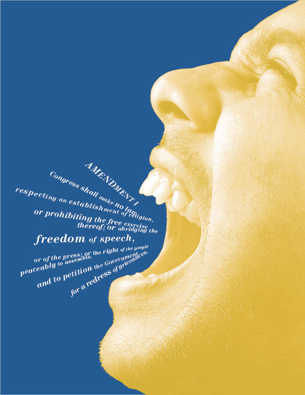
Describe, in detail, the difference in communication of the same content across the three final pieces.
1. For the first piece, I wanted a nice clean communication of the content. The essence of the content is freedom and I wanted a wide open space of color to reflect that...hence the wide open blue. I also feel that the Amendment's and what they stand for reflect strength. This is the reason I decided to have Amendment in the white carrying the weight of the blue and the space developed to hold Freedom of Speech. It reminds me of great pillars holding up a monumental structure. For the main body of text describing the amendment, I used yellow on the white...I wanted this quiet and subdued but available if the viewer really wanted to read it. It also adds a decorative element commonly found in our currency.
2. For the second piece, I wanted the main text to mimic chatter or conversation. I closed up the leading to create some texture and a faster read to the copy. I used an italic here as well to give it some movement. I then made "of speech" in the same text treatment to connect it with chatter. As I mentioned above, the essence of the amendment is freedom...so I thought making Amendment and Freedom in the same type color would make a connection. Also, if the viewer just read that, I would be OK with it...they would walk away with the essence of the communication. To reinforce this connection...I made Amendment and Freedom in the same type size. Also, the chatter above and "of speech" are the same type size. It's a subtle connection and hard to notice...because of the subtle scale change...but non the less, it's there.
3. For the third version, I let the image do the talking. It's very powerful and the copy definately takes a back seat. This one has a lot more character than the other ones and I think it's the strongest. That being said, I don't think my color concept is as evident in this one though...it's definately stronger in the first example.
Which of the three is the most successful? Why?
I suppose it depends on the objective of each piece. The more I think about it though...I think the first one is strongest. Reason being, every design element has a really strong purpose. I'm not sure that the third one does...because the image was supposed to be the supreme ruler in the third piece, I'm not sure I put enough TLC into the copy. I certainly spent time on it....and was very deliberate with my placement...but thought it was very secondary to the art. Yeah, I definately think the first one takes the cake for me anyway. I think if people spent time with it they would appreciate it...even though three is a bit more visually compelling. Wow, I'm feeling super BiPolar in this post.
Explain your choice of color, type and imagery as it relates to the concept of you content's hierarchy.
Color-I chose blue,yellow and white because of the presidential seal. Even without the ideal of the seal these colors resinate with me as being governmental and presidential. I'm not sure if it's the blue suits all the politicians where or what...even though they are more Navy blue than the value I chose. I also think the tonal values are a nice match...they are not viciously contrasty and play well together.
Type-I used Century, this type is used for a lot of text books and has a nice historic feel to it. It feels old, but in an elegant, sophisticated, strong kind of way. It also had a lot of different weights to explore with.
Imagery-I wanted to use a strong image of someone screaming or just being very vocal. Expressing their freedom of speech and embracing it. I used the image very large and cropped off the page...I wanted it to take up a descent amount of the composition, so it would be very dynamic and very present.
Sunday, October 14, 2012
Project: Voice
Where? A corner in the LEGO creative department leading to the color printer. This is a high traffic area.
Audience- Any of the designers, project managers and Prepress folk who want to see what Meat(Mike Sion) is up to.
Why? Through the years Mike has acquired an almost cult following of fans anticipating his next unusual action or event. This text is to remind everyone to go check out what he's up to after or before you get your print. Some of his events/actions; Ate thawed out 3 day old Boca burgers from desk drawer, eats cucumbers straight up without peeling, eats corn/tuna fish straight out of the can, carries sandwiches from home in a huge plastic bag...so they no longer are intact sandwiches when they get to work, removed front passenger seat from car to make easier access to child seats in rear, paved his front yard, hates to get gas and will drive his car until he runs out, listens to astronomy and physics books while working.
How does your design provoke action/reaction from the viewer? I think it gives them a sense of curiosity and wonderment of what he is up to. It also provokes his personality and free spiritness. Meat sits right past the color printer...so it's not a far jaunt to quickly see what he's up to. It's a nice 5 minute break from the craziness of the day...a little entertainment to make the day more fun. I also think the type provokes some softness to the hard realities of the everyday work. The deadlines, clients and chaos of the day takes a toll sometimes. I wanted this to feel like a breath of fresh air.
Describe your reasoning and inspiration behind the final typographic treatment/style- My design incorporates a little bit of Meats personality and a little bit of a carnival vibe. The typeface I used for Meat's name has a hippie feel to it. He is very O'natural and really basic...also, I'm pretty sure he's done a lot of drugs as a young chap. It also has an organic natural and earthy feel to it. For the Print Emporiam typeface, it has a nice carnival/circus feel to it. The reason I chose this was because of his crazy/unusual events and actions he produces...it reminds me of a carnival/circus/freakshow.
Saturday, September 29, 2012
Project: Rhythm
1. Describe the rhythmic concept behind your image selection and the overall sequence of the book from start to finish.
The rhythmic concept for my book was based on angles. I used each panel and it's lines to connect to one another. I also integrated the text to follow these lines throughout the book. The subject matter was skateboarding and I think the angles helped show the dynamic nature of the sport.
2. How did working with found/accidental imagery challenge your perceptions of cropping and composition?
I think it was interesting to discover the unexpected compositions. It was like putting a puzzle together and just trying to find the right pieces. I also really enjoyed trying to get a collective composition that felt right as a whole. It was nice spreading out all the pieces and then mix and matching them together.
3. Discuss the layering process of found type with your own typography and the overall hierarchy created in the end.
It was interesting figuring out how to break up the paragraph. My thought process was to just make it easily digestible to the reader and to break it up into somewhat balanced pieces. I also looked at key indicators of line breaks(commas,hyphens, etc..). As far as scale and hierarchy, I essentially just tried emphasizing the most important words, or what I thought to be the most important to the messenging. The words with the most meat on the bones is what I focused on.
4. How did you engage the grid in this smaller, more editorial layout?
I actually didn't use it much...reason being, the strong angles created they're own type of grid. So I used that to align type and dictate where it lived on the page. I think if I were to revisit this though...I would use more of the inset type imagery(2 extra squares we had to fit in) and play with the underlying grid a bit more. It could have held things together a bit more.
Thursday, September 27, 2012
Project: Grid
1. Explain your chosen emotion, the 3-step color progression and initial grid composition.
Anger was the emotion I chose, it seemed to have a great amount of visual baggage that would work well for a composition. Anger starts with an action and then quickly moves into your thought process. Most people try to fight it and not let it take them over. They don't always win and that's when a fight/confrontation insues or there is some verbal remarks. It's very interesting the struggle that is created within yourself when anger arises.
3-step color progression for Grid 1- I chose Red, Maroon and black. They are kind of cliche colors for anger but thought they would work well within this context. Red was the lead off color and had the most energy/heat to it. It seemed the most emotionally charged. The maroon color for me, felt like the initial red(initial angry emotion) started to mix with the other emotions....such as, denial that your angry, like injustice has been done to you and pure revenge is on the horizon. They start to feed each other and blend into one another...that's where control starts to be lost and the black emotions sink in. The black felt like you were being brought to that dark place of no return.
Initial Grid composition-I struggled with this a bit, I wasn't sure if I wanted to start the initial red square at the top or bottom. The reason I would start it at the top was because the idea of falling out of control. On the other hand, starting it at the bottom could create the sense of something building and growing as it progressed. I think it could have worked both ways but feel confident that the second choice was the best.
2. How did language and typography force the color story to grow and/or evolve by the end of Part 2?
I think by the choice of typeface and scale I was able to reinforce the color story. I relied on textures mainly to tell the story on Grid 1 and type style and scale of the words on Grid 2. For me, it felt easier to tell the story on Grid 2. It was like I had more tools to work with to express the emotion.
3. Describe how you translated a composition of modular images into a typographic design rooted in the same grid usage?
I basically relied on type style and scale to tell the story. It was also easier to break the grid on the typographic version....I think this also helped tell the typographic story of the emotion. Element could be less perfect and more agitated. They could also be more expressive and not so rigid. Not to say, this couldn't be done with Grid 1, but it would have taken a lot longer I feel.
4. What effect did your chosen typeface have on the final story's tone?
I think it had a lot of influence on the tone. I chose this typeface because of it's distressed feel and it's weight. The weight has a strong feeling to it, which I think mimics our intentions to fight these negative emotions...but also had the eating away of this strength that was expressed with the erosion of the type. It's illustrating the breakdown of this strength to try and do the right thing and not let it consume us.
Tuesday, September 11, 2012
Project: Color
Color-Active Orange, WFS-Mens basketball shorts at Department Store
Color-Zippy, WFS-Impulse items at checkout
Color-Simply Cider, WFS-Candles for Fall
Red Orange Text Color-Boils, Orange Background Color-Curry, WFS-Summer Grilling Accessories
Light Blue Text Color-Brisk, Orange Background Color-Frigid Orange, WFS-Icy Summer Treats(Freeze pops)
Yellow-Orange Text Color-Shear, Blue-Purple Color-Muscle, WFS-Sports Gear
Red-Orange 50% Color-Blazing, Neutral Orange Sale Color-Mustard Seed, Background Color-Guilded Gold, WFS-Cheap Lighters
Yellow-Orange Color- Southern Sunrise, Neutral Orange Color-Brickberry, Background Color-Ardentville, WFS-Fall/Thanksgiving accessories or decorations
Yellow-Orange Sale Color-Easytime, Neutral Orange 50% Color-Ho-hum peanut, Background Color-Tomato bisque, WFS-Whole foods soup display
1. Colors have a temperature, a mood, a perception–what were your initial assumptions/preconceptions of this color? Orange has always had the obvious association with Halloween for me. I can't really think of a corporate identity or marketing campaign that I've seen that has really ever utilized it(maybe Gatorade). So, in a way, it was really new for me to explore. I always liked the color orange, it's active and lively. I've always liked it combined with grey too. It's a very unique combo and I think because orange is so energetic, it plays well against the neutrality of grey in the spectrum. I'd really like to keep exploring it more and find it's potential and strength.
2. How has your understanding of this color–and how this color pairs with others–evolved? Consider the naming exercise and your answers to "What's for sale here?" I haven't used orange in a lot of designs through the years...even working for a toy company, it hasn't been my go to color. So it was interesting investigating it, especially the neutral tones. The neutral tones were interesting because I have a hard time accepting the muddy nature of them. That being said, I am excited about the diversity of neutral tones and how that could be used to create a really dynamic design. I'm used to using a couple of different values within designs but never explored a really broad range together.
3. What have you learned about color–and combining colors–that you did not know before? Think about your own color exploration and also that of your fellow classmates. The most interesting insight for me, was the effect of combing white into adjacent colors and it's effect of softening them. I've never really noticed that before but seems like a great tool. Another insight was just be reminded to be really intentional with my color choices and how they work with each other. I know for me, in my daily work, projects need to be turned around quickly and sometimes I don't get to examine color combos as closely as I would like.
4. Why this typeface? How did the escalating complexity of color in your design change the tone of the typographic message and the power of the figure/ground? I picked Helvetica Neue Extra Black Condensed Oblique because of it's weight strength and implied movement. I also liked it because it reinforced the importance/voice of the marketing message. I think the color combos in combination with the font did a couple of different things based on the context. Depending on the background color against the text it either was a quite voice or a louder more direct voice.
Color-Zippy, WFS-Impulse items at checkout
Color-Simply Cider, WFS-Candles for Fall
Red Orange Text Color-Boils, Orange Background Color-Curry, WFS-Summer Grilling Accessories
Light Blue Text Color-Brisk, Orange Background Color-Frigid Orange, WFS-Icy Summer Treats(Freeze pops)
Yellow-Orange Text Color-Shear, Blue-Purple Color-Muscle, WFS-Sports Gear
Red-Orange 50% Color-Blazing, Neutral Orange Sale Color-Mustard Seed, Background Color-Guilded Gold, WFS-Cheap Lighters
Yellow-Orange Color- Southern Sunrise, Neutral Orange Color-Brickberry, Background Color-Ardentville, WFS-Fall/Thanksgiving accessories or decorations
Yellow-Orange Sale Color-Easytime, Neutral Orange 50% Color-Ho-hum peanut, Background Color-Tomato bisque, WFS-Whole foods soup display
1. Colors have a temperature, a mood, a perception–what were your initial assumptions/preconceptions of this color? Orange has always had the obvious association with Halloween for me. I can't really think of a corporate identity or marketing campaign that I've seen that has really ever utilized it(maybe Gatorade). So, in a way, it was really new for me to explore. I always liked the color orange, it's active and lively. I've always liked it combined with grey too. It's a very unique combo and I think because orange is so energetic, it plays well against the neutrality of grey in the spectrum. I'd really like to keep exploring it more and find it's potential and strength.
2. How has your understanding of this color–and how this color pairs with others–evolved? Consider the naming exercise and your answers to "What's for sale here?" I haven't used orange in a lot of designs through the years...even working for a toy company, it hasn't been my go to color. So it was interesting investigating it, especially the neutral tones. The neutral tones were interesting because I have a hard time accepting the muddy nature of them. That being said, I am excited about the diversity of neutral tones and how that could be used to create a really dynamic design. I'm used to using a couple of different values within designs but never explored a really broad range together.
3. What have you learned about color–and combining colors–that you did not know before? Think about your own color exploration and also that of your fellow classmates. The most interesting insight for me, was the effect of combing white into adjacent colors and it's effect of softening them. I've never really noticed that before but seems like a great tool. Another insight was just be reminded to be really intentional with my color choices and how they work with each other. I know for me, in my daily work, projects need to be turned around quickly and sometimes I don't get to examine color combos as closely as I would like.
4. Why this typeface? How did the escalating complexity of color in your design change the tone of the typographic message and the power of the figure/ground? I picked Helvetica Neue Extra Black Condensed Oblique because of it's weight strength and implied movement. I also liked it because it reinforced the importance/voice of the marketing message. I think the color combos in combination with the font did a couple of different things based on the context. Depending on the background color against the text it either was a quite voice or a louder more direct voice.
Subscribe to:
Posts (Atom)