Showing posts with label observations. Show all posts

Thursday, December 6, 2012

Observations: Navigation

This Website is a great example of clean easy navigation. It is called Leading Art and is a virtual gallery representing original one of a kind artwork by professional artists: oil paintings, sculptures, mixed media etc.The Navigation of this piece is a vertical format. You click on the white tabs with red text and it displays a drop down menu. You then click on the link and the surface interface(top layers) scroll vertically down to the content in that section. It scrolls right down with the background staying consistent and the same but the upper layer content changes before your very eyes. At any moment in the new section you can get back to any section you want through the white tabs which stay stationary with your choices of navigation. It's nice because it's very intuitive and simple to use.

Monday, October 29, 2012

Observations: Layers


David Carson-Don't mistake legibility for communication. In this example, David Carson is using typography as layers. The build up and layering of the repeated typographic message builds a distressed looking field of black color in which the word legibility lives.


Ray Gun-This is a spread taken from Ray Gun magazine. Layering is a staple within the design style of this magazine. Emotion created from text and image are the driving force...with legibility taking a back seat. This being the priority, there are many overlapping layers..either blocking portions of text or blocking image. Also, they use lower contrast text color against background color...this reduces the legibility even more and is completely opposite of traditional marketing strategies.They make you work a little more when reading the articles...which I think engages the viewer more and makes the interaction a more intimate experience.

Sunday, October 28, 2012

Observations: Scale


West Elm Catalog-In the first layout, the designers are using scale to add contrast to the featured content. On the right, they have a close up cropped shot of rugs. The left page has a nicely framed still shot of a bureau. The left is very recognizable right off the bat...the right, you need to do a little more work to decipher the featured products. It all adds visual interest to the page and keeps me there looking.
The second layout has a bit more contrast in scale. The right page has a full bleed nicely cropped shot of the bed. The left page has four insets that have the products framed up nicely with room to breathe. Like the first layout, the contrast creates a nice visually interesting spread.

Skateboarding Magazine Pro Spotlight-This is a quite simple layout that utilizes scale of image. On the right, a large subtly cropped full bleed image of Stefan. Contrasting this page, an action shot of him pushing down the street. The red holds everything together and leads your eye through the layout...it commands your attention because of the bold contrast of it against the subtle blues/greys of the background.

Saturday, October 27, 2012

Observations: Image


Mercedes-Benz AD-This Ad really caught my attention. I was held more by the image than the communication. But, after figuring out the image I finally made my way to the text. I think it works because it's a print Ad and you can spend some time with the layout. It's a really interesting image and fun to try and figure out.


Olly Moss-These Posters are so simple and beautiful. Even though they start with a simple silhouette, the imagery inside tells and epic story of the 3 different movies. The colors are also very intense and help support the imagery and the mood. The placement of design elements is wonderful in this series as well. For example, the two moons in the first version that make C3PO's eyes. In the second, cloud city making the iconic detail of BobaFett's helmet. And the third, the branches making up the shape of Darth Vaders eys.


Draplin Design Co.-Iowa all the way poster. Draplin is from the midwest and his design is greatly influenced by that. He also has done many political influenced pieces. This piece is a celebration of the state and all that it has to offer. His color choice was influenced by cornfields, sunsets, harvest and autumn in Iowa. The images are representations of content that was born or created in Iowa. I really love his art and his use of flat color....that detail is consistent and a red thread through all his work.

Saturday, October 20, 2012

Observations: Voice


Ghostland-I've been collecting designer vinyl toys for about 10 years now. This is a series from brian Flynn, who is the owner of Super 7 Toy company and Hybrid design firm in San Francisco. He created this sub brand series under Super 7 and It has a really beautiful voice to it. When you see the packaging/logo in real life, it is beautifully printed and has a really strong identity that completely fits with the toy. It speaks to the goofiness of the characters and the mood of the spooky genera.


Olly Moss-Evil Dead Poster. Not much text but the visual voice speaks volumes. All the design elements are really working together here to convey the message. The warm fiery tones inside the silo of the hand really create a mood of destruction and fear. The silo of the hand is really nice because of the state in which it is in...it's grasping for help and reaching for hope of being saved. Adding to this feeling is the hand breaking through the ground and the earth being tossed about. Like someone is digging their way out of a grave. The composition is also working nicely by being at a 30 degree angle...it gives it a dynamic feel.


Frank Kozik-Kozik is another artist who has entered the vinyl toy industry. He's well know for his hard core posters he's done through the years. He has a really specific, screw authority and government kind of vibe. A lot of his work has an anarchist feel to it. He's not my favorite artist but I definately respect the identity he has created with his work. This poster has a definite voice to it...the distressed typeface along with the miss matched type creates a screw the traditional headline feel to it...hence, screw authority...we're doing it our way. The colors he uses also creates a harsh, raw vibe. The red and blacks that are often used for angst or anger...not to mention the shapes those colors live in are by no means perfect...they are unrefined, raw and o'natural. It's like a collage made of things just lying around.

Friday, October 19, 2012

Observations: Hierarchy


John Mees Ad-I love the hierarchy in this Ad...it's so clean and straight forward. The type size and color really make this read easy.


 Nike Ad-Very straight forward and traditional hierarchy. It just feels like every design element has a nice cozy home within the composition.


Blaine Fontana-Overlook Village Celebration poster. A good example of some more extreme scale changes with copy. The supporting design elements do a good job directing the eye as well.

Friday, September 28, 2012

Friday, September 14, 2012

Observations: Grid


Blaine Fontana
One of my favorite artist. He uses grids and segmentation a lot.


Nike Snowboarding Campaign
Designed by Hybrid Design in S.F.

Wednesday, September 12, 2012

Observations: Type

Detail Devil-Type
Great use of actual/similiar characters within each word.

Observations: Figure/Ground


Junction Skatepark Logo
My friend Roger designed this logo for a local skateboard park in Western Ma. I've always really enjoyed this logo. The negative space create a silo of a skateboard truck and wheel.  


NCAYV Logo
This is one of my favorite logos. I love the arrangement of the two rectangles to create such a dynamic composition. It's just the right balance and arrangement with foreground and background elements.
Client: It was a White House initiative to educate parents about teenage violence.  
Description: The urgent nature of the anit-vioence campaign is suggested in the logo through two bold images: a dove and upraised hand, reversed-out of two rectangular shapes in red-orange and black. Designed to look as if it were hastily cut out of paper, the logo recalls the visual power of protest posters from the 1950s and 1960s.


The Mattress Factory Logo
I really like the play of the black F against the white background form, which is just the reversed form in white. I definately toggle back and forth between the two elements. It's interesting that the white upside down F is the most contrasty element against the background but I am immediately drawn to the Bold Red M. It's very powerful against the black.
Client: A contemporary Art Museum.
Description: Just as the museum's art is characterized by it's flexible, interactive qualities, so the museum's logo encourages viewer participation.


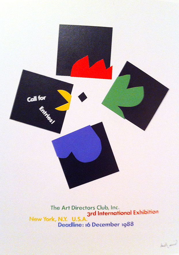
Call for Entries-Paul Rand
Such an inspirational piece for me. Paul Rand is one of my favorites.

Observations: Color


Primary Colors-LEGO Brand Retail Store-Pick A Brick Wall
Kids can purchase a small or large cup to fill up with LEGO Bricks to purchase. LEGO now has a diverse range of colors and add new ones every couple years. It's no longer just primary colors and it's refreshing to have a full range of colors to choose from for designs.


Primary Colors-LEGO Brand Retail Store
There are a couple of different designs to our LEGO Stores based on real estate and location. This particular one is referred to as "A Yellow Store". We also have the Flagship stores that are much larger and have a broader breadth of product. Yellow is essentially our corporate color and is composed of C-0, M-15, Y-100, K-0. Just to give some context of where the PAB Wall lives. It's located in the back of the store near check out. 


LEGO and the LEGO logo are trademarks of the LEGO Group. ©2012 The LEGO Group.