Sunday, November 25, 2012

Research: Corita Kent

Sister Mary Corita Kent was an artist and teacher who worked in LA and Boston.
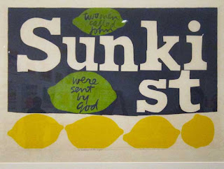
She mainly used silkscreen and serigraphy to create her artwork. The content of her art was usually about love and peace...which was appropriate for the social situations of the time during the 60s and 70s. Other types of work she created was poster, book covers and murals. She also won dozens of art prizes, turned out seven books and her work hung in many of the world's major art museums. She went to school at Immaculate Heart College in 1941 and then taught grade school in British Columbia. After doing that for a while she returned back to Immaculate Heart College to teach art in which she eventually became the chairman of the art department. She also earned a MA at the University of Southern California in Art History. She eventually moved to Boston and devoted all her time to making art.

Art
Mary's choice of medium was Serigraphy, which allowed her to create larger numbers available to the every day folk who couldn't afford expensive pieces of art. The goal and the most gratifying part for her, was to see people get a lift out of the art she created. It gave her great pleasure to see the work take people to higher greater place and give them happiness. She exhibited and sold most of her art at churches, community centers, galleries and fairs.

In the 50's her prints had a painterly quality to them and focused on religious figures such as the Madonna and various psalms. In 1955 she started introducing words into her art. Most of the work below looks like it's around this time period. Her later work started to use scale much more and used type more of image. It's interesting to see the recurring design decision of writing words backwards. It's an interesting detail that really gets your attention and pulls you into the work. In the 60's she had a growing interest with urban environments and it's signage systems. The post WWII era produced a new level of consumer culture. It was felt through advertising...billboards and media. It created a new exposure to images, slogans, textures and color. This was a huge influence for Mary and she soaked it all in. Her color palette was full of color and really grabbed your attention.


Tuesday, November 20, 2012

Project: Navigation


Describe your app's intended audience and navigational concept.
My app is called Adepto. It's latin for, "to gather or collect". I thought this name was appropriate because I am gathering and collecting information on design for the viewer or subscriber. The intended audience is anyone who is interested in design or art and looking for inspiration.
The navigational concept or inspiration is based on "Plinko", which is the game from the Price is Right. I wanted the viewer to fall through the vertical space and encounter the concepts/content learned throughout the semester. I used the white space as a guide or path through the content. At the end of each section I made a conscious decision to make the art full bleed...to let the reader know that this was the end of this section. Then the swirlies/scribbles would pull you into the art within the circle and header for the next section. In addition to scrolling down the through the content, I made buttons out of the headers on the FC. Each button will take you to the appropriate content. I also created 2 violater callouts that link to my blog.

Explain the content structure(hierarchy and connectivity). 
I created the hierarchy based on a couple of things. The first, I wanted the observations to be kind of a set up for the rest of the content the viewer would experience...kind of a sampling. That's how I thought of it through the semester. It was great to "see what's out there" before creating our own interpretation of the concept. This was a lead up to Projects...which takes the examples of other people's work and now show's implementation of ours.
The second reason, I wanted a kind of build up to the feature. That's why I made the first circle(observations) the smallest...it get's substantially bigger by the time you get to the feature. This was to identify it as the big bang. In an ideal world, I would have made the feature much longer and with more copy/content. 
Also, the color hierarchy was based off of the Adepto logo. I used the sequence of colors within the logo to create the different section strokes and swirlies/scribbles. It was just an underlying visual link and framework. I also took that opportunity to use complimentary colors within each section.

Discuss the grid, rhythm and voice of the piece as we move throughout.
How did this change/evolve with the physical reinterpretation?
Grid- I used a four column grid. It worked really well and I ended up breaking it on the FC. It was funny as I was working on it, because I didn't think I would break it that quick. I used it as much as possible. Also, to make the Research and Feature sections a little different, I decided to use two columns for copy. For the observations and projects I tried to keep the copy to one column.
Rhythm- I wanted a type of dramatic build up to the feature. To do this, I created a little bit more open white space towards the top of the design. I wanted the FC to be really inviting and open and then create a build up to the feature. Content get's a little more intense towards the bottom(less white space).
Voice- I think the voice has a modern, artsy, design vibe to it. I've always really appreciated design that brings in the other visual arts, that's why I wanted the colorful swirlies and scribbles. I wanted something playful, fun and energetic. I also wanted the design to reflect how much I love and appreciate graphic design. 


Discuss the inspiration behind the physical execution and the relationship between the virtual and physical pieces.  
My inspiration for the physical piece was to make it playful and fun. I picked up on the angles that I used in the 2D piece and wanted to carry that into the 3D piece. I also wanted to bring the scribbles to life. I thought the yarn was playful and fun and would be a great tool to bring things to life. The shapes feel great in the hand and I wanted them to be interacted with in the physical piece. There is art on every angle and a new thing to explore with every turn. In addition to the angular pieces, I included two Dunnies(vinyl art toys) that relate to the Feature article on Blaine Fontana. They are a great example of bringing 2D to 3D and thought it would be great to integrate into the piece. Blaine Fontana is one of many fine artists that hook up with designer vinyl toy companies to create figures based on their art. Another one to check out is Joe Ledbetter...he's another favorite of mine and I have many of his toys.

Sunday, November 11, 2012

Project: Layers


This concept was based off a Daily Show segment called “Please for the love of god make it stop” in which Paul Ryan went to a homeless shelter and was filmed cleaning clean dishes. The idea of staging such an event screams Propaganda. That gave us the idea to use a Banksy/Obey Giant/street art type feel to the design. This type of arts topics are often thought of as the anti authority voice for such topics.


The topic was the subject matter of Jobs for this coming election. What came out of this, was the idea of a candidate stretching the truth. Who knows what to believe? So we had a statement from each candidate and then the truth of the matter based off true statistics. In addition to this, we had the idea of how effected the job market is right now and how it is effecting the common everyday people.


This concept was based off the idea of a ballot sheet and the check boxes you will find when it’s your time to vote.


We wanted this design to reflect the visual and conceptual project as a whole. We gathered the strongest assets from the whole project and put them together in this final piece.

Research: Charles and Ray Eames

Charles and Ray Eames were American Designers who made huge contributions to the field of Industrial design, graphic design, photographic arts, manufacturing and architecture. The were literally had a "jack of all trades" mentality and showed no boundries on what could or couldn't 
be designed. 

Charles was born in 1907 in St.Louis Missouri. He went to school there and became interested in engineering and architecture. He then attended Washington University for two years. After attending for two years he was offered a job in an architectural firm. After gaining experience there he started his own firm in 1930. He began expanding his design ideas beyond architecture and received a fellowship to Cranbrook Academy of Art in Michigan, where he eventually became head of the design department.

Ray Eames was born in 1912 in Sacramento, California. She studied painting with Hans Hofmann in New York before moving on to Cranbrook Academy where she met and assisted Charles and Eero Saarinen in preparing designs for the Museum of Modern Art's Organic Furniture Competition.


Charles and Ray married in 1941 and moved to California where they continued their furniture design work. During the war they were commissioned by the Navy to produce molded plywood splints, stretchers and experimental glider shells. In 1946, Evans Products began producing the Eameses' molded plywood furniture.  Their molded plywood chair was called "the chair of the century" by the influential architectural critic Esther McCoy. In 1949, Charles and Ray designed and built their own home in Pacific Palisades, California as part of the Case Study House Program sponsored by Arts and Architecture Magazine. Their design and innovative use of materials made this house a mecca for architects and designers from all over the world. It is considered one of the most important post-war residences built anywhere 
in the world. In the early 1950s, the Eameses extended their interest and skill in photography into filmmaking. They created over eighty-five short films ranging in subjects from tops to the world of Franklin and Jefferson, from simple sea creatures to the explanation of mathematical and scientific concepts, such as the workings of the computer. 

Furniture 
Early in their careers Charles and Ray identified the need for affordable, yet high-quality furniture for the average consumer. For forty years they experimented with ways to meet this challenge. They experimented with four different materials-Molded plywood, fiberglass-reinforced plastic, welded wire mesh and cast aluminum. They're whole concept or goal for the creation of these chairs was to find the perfect form to compliment the human form and to make them as comfortable as possible. I am a huge proponent of functionality over form and really love that their functionality in the chairs really dictate the form of them. By doing this, they created something totally new and innovative.


Toys
In addition to furniture, the Eames also created toys. Charles was quoted as saying, "Toys are not really as innocent as they look. Toys and games are preludes to serious ideas.” I really like this quote and can relate to it in my own company. This is one of the great qualities of LEGO, it's a very simple concept for a toy but it's so inspirational and has lead to many great careers because of it's influence. Architects and engineers have been really influenced by it and they say that's why they've gone after those careers. It's so true, it's such an innocent toy but has been a prelude to these major engineering feats. It's funny because there has been the idea floating around the company every few years to do testimonial type advertising with celebrities, engineers and architects that have been influenced by LEGO. It hasn't happened yet, but just imagine how amazing it would have been to be endorsed by Charles and Ray Eames.


Graphic Design 
As if furniture design and toy design wasn't enough, the Eames also did graphic design and created things such as invites, brochures, posters, packaging designs, print and press advertisements. Ray Eames had a background in art and a bold graphic design style, Ray’s work was cutting edge and she designed several covers for the landmark magazine Arts & Architecture during the 1940s. I'm really interested in their design work but it seems like there is not much know about it. It seems like it wasn't documented as thoroughly as their furniture and toys. From what I've seen though, it seems just as diverse as they're list of things they've created. It doesn't seem like it's one specific style but doing exactly what they've done all along with they're designs...each piece is unique to the content and has it's own expression of what it is. It's great, because it's easy for modern day graphic designers to get stuck creating the same solution to different design problems. It ends up making them not unique, different and fresh. It's impressive that the Eames were so good at graphic design in addition to all the other hats they wore.


Saturday, November 10, 2012

Outside Reading: Matthew Carter

Bio
Matthew is a type designer from London England. He is the son of the English type designer Harry Carter. He currently resides in Cambridge Massachusetts. Matthew started off his career as an intern at the Joh. Enschede type foundry in the Netherlands. He spent a year in the netherlands learning from Jan van Krimpen's assistant P. H. Raedisch. He eventually returned to London and became a freelancer and a typographic advisor for a company specialized in phototypsetting machines.
His career has spanned the transition from physical metal type to digital type. Which has given him a broad range of expertise and experience through the years. One of his first major assignment and success's was to redesign the Bell telephone company's typeface for their phone books. With his typeface redesign, he ended up creating a typeface that could fit more content on pages of their books, which decreased the size of them and in turn saved the a tremendous amount of money and more importantly the amount of paper/trees that were being used to create them. In 1981 Carter and his colleague started a digital type foundry called Bitstream.

Typefaces and personal inspiration
Carter has a tremendous amount of work that he has created through the years. In addition to this, he has contributed so much to the typography industry and has been an inspiration to up and coming typographers.
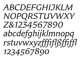
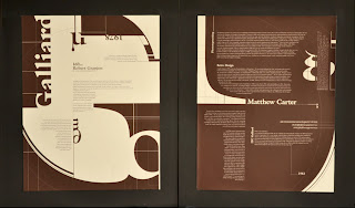
Here is a list of typefaces that he has created: Bell Centennial, Big Caslon, Bitstream Charter, Big Figgins, Carter Sans, Cascade Script, Elephant, Fenway, ITC Galliard, Gando, Georgia, Mantinia, Meiryo, Miller, Monticello, Nina, Olympian, Rocky, Shelley Script, Snell Roundhand, Skia, Sophia, Tahoma, Verdana, Vincent, Walker, Wilson Greek, Wrigley and Yale.
My first experience with Matthew Carter was at my undergraduate school, The Art Institute of Boston, he gave a lecture on typography and I was captivated by it. The story of his career and the examples of his work were phenomenal. But there was one part in his lecture that really resinated with me. He talked about how his current company he worked for would send him to conferences all around the world. He had mentioned that most of the time he would never even go to the conference and instead would meander about the town or city where it was being held in search of typography. He showed photographs of these discoveries and they were the most beautiful photographs of typography ever. He had everything from gravestones to distressed road paint, chipped away from the word stop at an intersection. He was more intrigued, interested and fascinated by the hidden typography gems around the city than the actual lectures that he was missing. It was inspiring and just showed me that you need to follow your heart and go with what really inspires you and captures your interest. This can only make your creativity smarter, stronger and grow deeper.