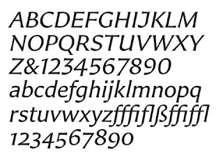
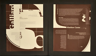
Matthew is a type designer from London England. He is the son of the English type designer Harry Carter. He currently resides in Cambridge Massachusetts. Matthew started off his career as an intern at the Joh. Enschede type foundry in the Netherlands. He spent a year in the netherlands learning from Jan van Krimpen's assistant P. H. Raedisch. He eventually returned to London and became a freelancer and a typographic advisor for a company specialized in phototypsetting machines.
His career has spanned the transition from physical metal type to digital type. Which has given him a broad range of expertise and experience through the years. One of his first major assignment and success's was to redesign the Bell telephone company's typeface for their phone books. With his typeface redesign, he ended up creating a typeface that could fit more content on pages of their books, which decreased the size of them and in turn saved the a tremendous amount of money and more importantly the amount of paper/trees that were being used to create them. In 1981 Carter and his colleague started a digital type foundry called Bitstream.
Typefaces and personal inspiration
Carter has a tremendous amount of work that he has created through the years. In addition to this, he has contributed so much to the typography industry and has been an inspiration to up and coming typographers.
Here is a list of typefaces that he has created: Bell Centennial, Big Caslon, Bitstream Charter, Big Figgins, Carter Sans, Cascade Script, Elephant, Fenway, ITC Galliard, Gando, Georgia, Mantinia, Meiryo, Miller, Monticello, Nina, Olympian, Rocky, Shelley Script, Snell Roundhand, Skia, Sophia, Tahoma, Verdana, Vincent, Walker, Wilson Greek, Wrigley and Yale.
My first experience with Matthew Carter was at my undergraduate school, The Art Institute of Boston, he gave a lecture on typography and I was captivated by it. The story of his career and the examples of his work were phenomenal. But there was one part in his lecture that really resinated with me. He talked about how his current company he worked for would send him to conferences all around the world. He had mentioned that most of the time he would never even go to the conference and instead would meander about the town or city where it was being held in search of typography. He showed photographs of these discoveries and they were the most beautiful photographs of typography ever. He had everything from gravestones to distressed road paint, chipped away from the word stop at an intersection. He was more intrigued, interested and fascinated by the hidden typography gems around the city than the actual lectures that he was missing. It was inspiring and just showed me that you need to follow your heart and go with what really inspires you and captures your interest. This can only make your creativity smarter, stronger and grow deeper.


No comments:
Post a Comment