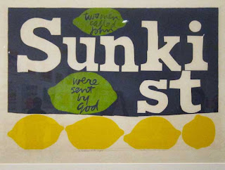
She mainly used silkscreen and serigraphy to create her artwork. The content of her art was usually about love and peace...which was appropriate for the social situations of the time during the 60s and 70s. Other types of work she created was poster, book covers and murals. She also won dozens of art prizes, turned out seven books and her work hung in many of the world's major art museums. She went to school at Immaculate Heart College in 1941 and then taught grade school in British Columbia. After doing that for a while she returned back to Immaculate Heart College to teach art in which she eventually became the chairman of the art department. She also earned a MA at the University of Southern California in Art History. She eventually moved to Boston and devoted all her time to making art.
Art
Mary's choice of medium was Serigraphy, which allowed her to create larger numbers available to the every day folk who couldn't afford expensive pieces of art. The goal and the most gratifying part for her, was to see people get a lift out of the art she created. It gave her great pleasure to see the work take people to higher greater place and give them happiness. She exhibited and sold most of her art at churches, community centers, galleries and fairs.
In the 50's her prints had a painterly quality to them and focused on religious figures such as the Madonna and various psalms. In 1955 she started introducing words into her art. Most of the work below looks like it's around this time period. Her later work started to use scale much more and used type more of image. It's interesting to see the recurring design decision of writing words backwards. It's an interesting detail that really gets your attention and pulls you into the work. In the 60's she had a growing interest with urban environments and it's signage systems. The post WWII era produced a new level of consumer culture. It was felt through advertising...billboards and media. It created a new exposure to images, slogans, textures and color. This was a huge influence for Mary and she soaked it all in. Her color palette was full of color and really grabbed your attention.


No comments:
Post a Comment