Sunday, September 30, 2012

Research: Sol LeWitt

Sol LeWitt was a Fine Artist who started his career in New York in the 1950's. His main choice of medium was painting, drawing, sculpture and printmaking. His genre was labeled or focused around Conceptualism and Minimalism. A huge amount of his work dedicated to Wall drawing...with the other huge amount being devoted to sculpture or as he referred to it, "structures".  He was very interested in linearness, color, structure and modulation of forms. Below are some examples of his Wall drawings and Modular "structures".


Sol LeWitt Wall Drawings-


Sol LeWitt-Wall Drawing #260-Chalk on painted wall
I really like this wall drawing by Sol LeWitt. In my research of him, it mentioned that he was very into Modules and systems. This definately feels very systematic and structured. I love structure and having a plan within design and art. In my daily work I am always reinforcing the importance of consistancy and to maintain the structure of the books(maintaining style guide rules, making sure text cross aligns, etc...).


Sol LeWitt-Wall Drawing #681 C
This set of wall drawings are similiar to the ones created at Mass Moca. It was interesting to find out that most of his wall drawings have been created by other artists and not by his own hand. It's said that he would create the "recipe" for the drawings and let the artist or whoever create them based on his instructions. The only stipulation was that they be erased. This way he would deprive collector's, gallery owners, curators works by his own hands. He said there would be nothing to store, ship, insure or bid on. He would though create a signed certificate of authenticity that the project existed.


Sol LeWitt-Wall Drawing #684A
Here are some quotes/descriptions I found describing LeWitt's wall drawings: Peter Schjeldahl(an
Art Critic) has been quoted as saying, "LeWitt’s work is “clear, accessible, and generous… . He structures large understandings of perception and thought… . His wall drawings belong in a hall of fame for parsimonious, incredibly potent inventions, like the lever and the wheel… . His art belongs directly to the viewer.”

Also, from David Littlejohn, explained the wall drawings in this way: “By way of curt, gnomic verbal recipes for arrangements of repeated lines and geometrical shapes, LeWitt tried to remove from his creations all traces of narration, pictorialism or personal emotion."

I like how it is described as belonging directly to the viewer...it definately has a quality of not being constructed and there was no artist involved in it's creation. It's as if it always was there and always existed. Reading into this a bit, I think it could be because of the colors that are very natural and found in everyday life. We're surrounded by these colors and have been our whole life....so there is a sense of belonging to the viewer.

I also agree with the second statement of the drawings being removed from all traces of narration, pictorialism or personal emotion. The really do just exist. I also think the use of so many colors together on some of the drawings have this effect of not pigeon holing you into a specific emotion or feeling. There are so many colors together that they almost cancel each other out leaving you neutral.


Sol LeWitt Structures-


Sol LeWitt-Geometric Structure 2-2, Painted Wood
Sol LeWitt liked to refer to his sculptures or three-dimensional work as "Structures". He was obsessed with the Cube as a young boy and it is a recurring element in his work throughout his career. He started by having inclosed cube forms with none of the internal structure showing but shifted his work to start showing the internal structure of the cubes. In addition to the Cube, he would use other open structured modular pieces to create a variety of different cube like structures. In addition to wood, he also used cinder blocks and cement as mediums for his work.

Saturday, September 29, 2012

Project: Rhythm


1. Describe the rhythmic concept behind your image selection and the overall sequence of the book from start to finish.
The rhythmic concept for my book was based on angles. I used each panel and it's lines to connect to one another. I also integrated the text to follow these lines throughout the book. The subject matter was skateboarding and I think the angles helped show the dynamic nature of the sport.

2. How did working with found/accidental imagery challenge your perceptions of cropping and composition?
I think it was interesting to discover the unexpected compositions. It was like putting a puzzle together and just trying to find the right pieces. I also really enjoyed trying to get a collective composition that felt right as a whole. It was nice spreading out all the pieces and then mix and matching them together.

3. Discuss the layering process of found type with your own typography and the overall hierarchy created in the end.
It was interesting figuring out how to break up the paragraph. My thought process was to just make it easily digestible to the reader and to break it up into somewhat balanced pieces. I also looked at key indicators of line breaks(commas,hyphens, etc..). As far as scale and hierarchy, I essentially just tried emphasizing the most important words, or what I thought to be the most important to the messenging. The words with the most meat on the bones is what I focused on.

4. How did you engage the grid in this smaller, more editorial layout?
I actually didn't use it much...reason being, the strong angles created they're own type of grid. So I used that to align type and dictate where it lived on the page. I think if I were to revisit this though...I would use more of the inset type imagery(2 extra squares we had to fit in) and play with the underlying grid a bit more. It could have held things together a bit more.

Friday, September 28, 2012

Thursday, September 27, 2012

Project: Grid


1. Explain your chosen emotion, the 3-step color progression and initial grid composition.
Anger was the emotion I chose, it seemed to have a great amount of visual baggage that would work well for a composition. Anger starts with an action and then quickly moves into your thought process. Most people try to fight it and not let it take them over. They don't always win and that's when a fight/confrontation insues or there is some verbal remarks. It's very interesting the struggle that is created within yourself when anger arises.

3-step color progression for Grid 1- I chose Red, Maroon and black. They are kind of cliche colors for anger but thought they would work well within this context. Red was the lead off color and had the most energy/heat to it. It seemed the most emotionally charged. The maroon color for me, felt like the initial red(initial angry emotion) started to mix with the other emotions....such as, denial that your angry, like injustice has been done to you and pure revenge is on the horizon. They start to feed each other and blend into one another...that's where control starts to be lost and the black emotions sink in. The black felt like you were being brought to that dark place of no return.

Initial Grid composition-I struggled with this a bit, I wasn't sure if I wanted to start the initial red square at the top or bottom. The reason I would start it at the top was because the idea of falling out of control. On the other hand, starting it at the bottom could create the sense of something building and growing as it progressed. I think it could have worked both ways but feel confident that the second choice was the best.

2. How did language and typography force the color story to grow and/or evolve by the end of Part 2?
I think by the choice of typeface and scale I was able to reinforce the color story. I relied on textures mainly to tell the story on Grid 1 and type style and scale of the words on Grid 2. For me, it felt easier to tell the story on Grid 2. It was like I had more tools to work with to express the emotion.

3. Describe how you translated a composition of modular images into a typographic design rooted in the same grid usage?
I basically relied on type style and scale to tell the story. It was also easier to break the grid on the typographic version....I think this also helped tell the typographic story of the emotion. Element could be less perfect and more agitated. They could also be more expressive and not so rigid. Not to say, this couldn't be done with Grid 1, but it would have taken a lot longer I feel.

4. What effect did your chosen typeface have on the final story's tone?
I think it had a lot of influence on the tone. I chose this typeface because of it's distressed feel and it's weight. The weight has a strong feeling to it, which I think mimics our intentions to fight these negative emotions...but also had the eating away of this strength that was expressed with the erosion of the type. It's illustrating the breakdown of this strength to try and do the right thing and not let it consume us.

Friday, September 14, 2012

Observations: Grid


Blaine Fontana
One of my favorite artist. He uses grids and segmentation a lot.


Nike Snowboarding Campaign
Designed by Hybrid Design in S.F.

Wednesday, September 12, 2012

Observations: Type

Detail Devil-Type
Great use of actual/similiar characters within each word.

Observations: Figure/Ground


Junction Skatepark Logo
My friend Roger designed this logo for a local skateboard park in Western Ma. I've always really enjoyed this logo. The negative space create a silo of a skateboard truck and wheel.  


NCAYV Logo
This is one of my favorite logos. I love the arrangement of the two rectangles to create such a dynamic composition. It's just the right balance and arrangement with foreground and background elements.
Client: It was a White House initiative to educate parents about teenage violence.  
Description: The urgent nature of the anit-vioence campaign is suggested in the logo through two bold images: a dove and upraised hand, reversed-out of two rectangular shapes in red-orange and black. Designed to look as if it were hastily cut out of paper, the logo recalls the visual power of protest posters from the 1950s and 1960s.


The Mattress Factory Logo
I really like the play of the black F against the white background form, which is just the reversed form in white. I definately toggle back and forth between the two elements. It's interesting that the white upside down F is the most contrasty element against the background but I am immediately drawn to the Bold Red M. It's very powerful against the black.
Client: A contemporary Art Museum.
Description: Just as the museum's art is characterized by it's flexible, interactive qualities, so the museum's logo encourages viewer participation.


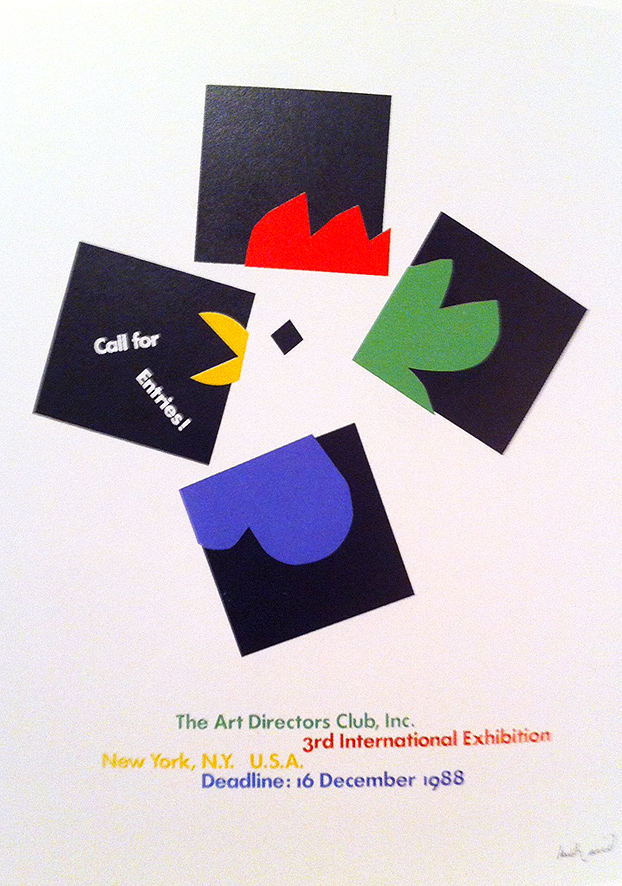
Call for Entries-Paul Rand
Such an inspirational piece for me. Paul Rand is one of my favorites.