Sunday, October 28, 2012
Observations: Scale
West Elm Catalog-In the first layout, the designers are using scale to add contrast to the featured content. On the right, they have a close up cropped shot of rugs. The left page has a nicely framed still shot of a bureau. The left is very recognizable right off the bat...the right, you need to do a little more work to decipher the featured products. It all adds visual interest to the page and keeps me there looking.
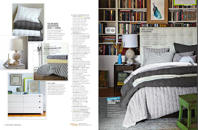
The second layout has a bit more contrast in scale. The right page has a full bleed nicely cropped shot of the bed. The left page has four insets that have the products framed up nicely with room to breathe. Like the first layout, the contrast creates a nice visually interesting spread.
Skateboarding Magazine Pro Spotlight-This is a quite simple layout that utilizes scale of image. On the right, a large subtly cropped full bleed image of Stefan. Contrasting this page, an action shot of him pushing down the street. The red holds everything together and leads your eye through the layout...it commands your attention because of the bold contrast of it against the subtle blues/greys of the background.
Labels:
observations,
scale
Subscribe to:
Post Comments (Atom)


No comments:
Post a Comment