

Describe, in detail, the difference in communication of the same content across the three final pieces.
1. For the first piece, I wanted a nice clean communication of the content. The essence of the content is freedom and I wanted a wide open space of color to reflect that...hence the wide open blue. I also feel that the Amendment's and what they stand for reflect strength. This is the reason I decided to have Amendment in the white carrying the weight of the blue and the space developed to hold Freedom of Speech. It reminds me of great pillars holding up a monumental structure. For the main body of text describing the amendment, I used yellow on the white...I wanted this quiet and subdued but available if the viewer really wanted to read it. It also adds a decorative element commonly found in our currency.
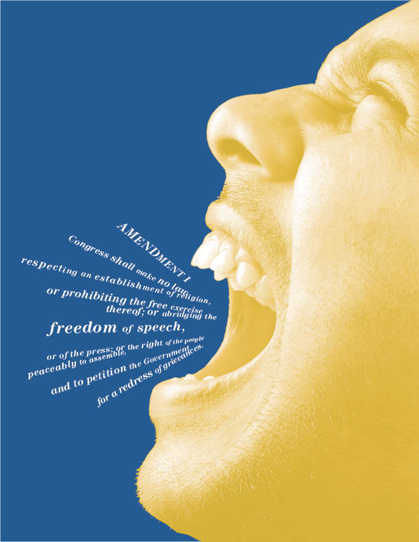
2. For the second piece, I wanted the main text to mimic chatter or conversation. I closed up the leading to create some texture and a faster read to the copy. I used an italic here as well to give it some movement. I then made "of speech" in the same text treatment to connect it with chatter. As I mentioned above, the essence of the amendment is freedom...so I thought making Amendment and Freedom in the same type color would make a connection. Also, if the viewer just read that, I would be OK with it...they would walk away with the essence of the communication. To reinforce this connection...I made Amendment and Freedom in the same type size. Also, the chatter above and "of speech" are the same type size. It's a subtle connection and hard to notice...because of the subtle scale change...but non the less, it's there.
3. For the third version, I let the image do the talking. It's very powerful and the copy definately takes a back seat. This one has a lot more character than the other ones and I think it's the strongest. That being said, I don't think my color concept is as evident in this one though...it's definately stronger in the first example.
Which of the three is the most successful? Why?
I suppose it depends on the objective of each piece. The more I think about it though...I think the first one is strongest. Reason being, every design element has a really strong purpose. I'm not sure that the third one does...because the image was supposed to be the supreme ruler in the third piece, I'm not sure I put enough TLC into the copy. I certainly spent time on it....and was very deliberate with my placement...but thought it was very secondary to the art. Yeah, I definately think the first one takes the cake for me anyway. I think if people spent time with it they would appreciate it...even though three is a bit more visually compelling. Wow, I'm feeling super BiPolar in this post.
Explain your choice of color, type and imagery as it relates to the concept of you content's hierarchy.
Color-I chose blue,yellow and white because of the presidential seal. Even without the ideal of the seal these colors resinate with me as being governmental and presidential. I'm not sure if it's the blue suits all the politicians where or what...even though they are more Navy blue than the value I chose. I also think the tonal values are a nice match...they are not viciously contrasty and play well together.
Type-I used Century, this type is used for a lot of text books and has a nice historic feel to it. It feels old, but in an elegant, sophisticated, strong kind of way. It also had a lot of different weights to explore with.
Imagery-I wanted to use a strong image of someone screaming or just being very vocal. Expressing their freedom of speech and embracing it. I used the image very large and cropped off the page...I wanted it to take up a descent amount of the composition, so it would be very dynamic and very present.
No comments:
Post a Comment